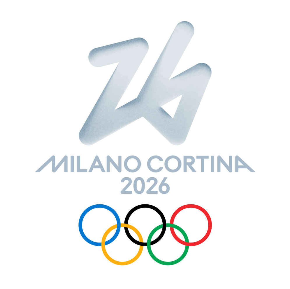
How Do You Design … the Olympic Games?
While the Olympic Games date back to antiquity, the idea of a unified visual identity – what is now known as the “Look of the Games” – is quite recent. Mexico City 1968 marked the first time the Olympics embraced a coherent branding system, drawing on zeitgeist-defining psychedelic graphics and the visual language of Huichol art. It is precisely this corporate design that Raffaella Paniè, the Director of Look of the Games for the Olympic Winter Games Milano Cortina 2026, cites as one of her all-time Olympic favourites: “It was one of the first truly systematic identities, with strong graphic and geometric elements, and it still feels incredibly contemporary today”, she says.
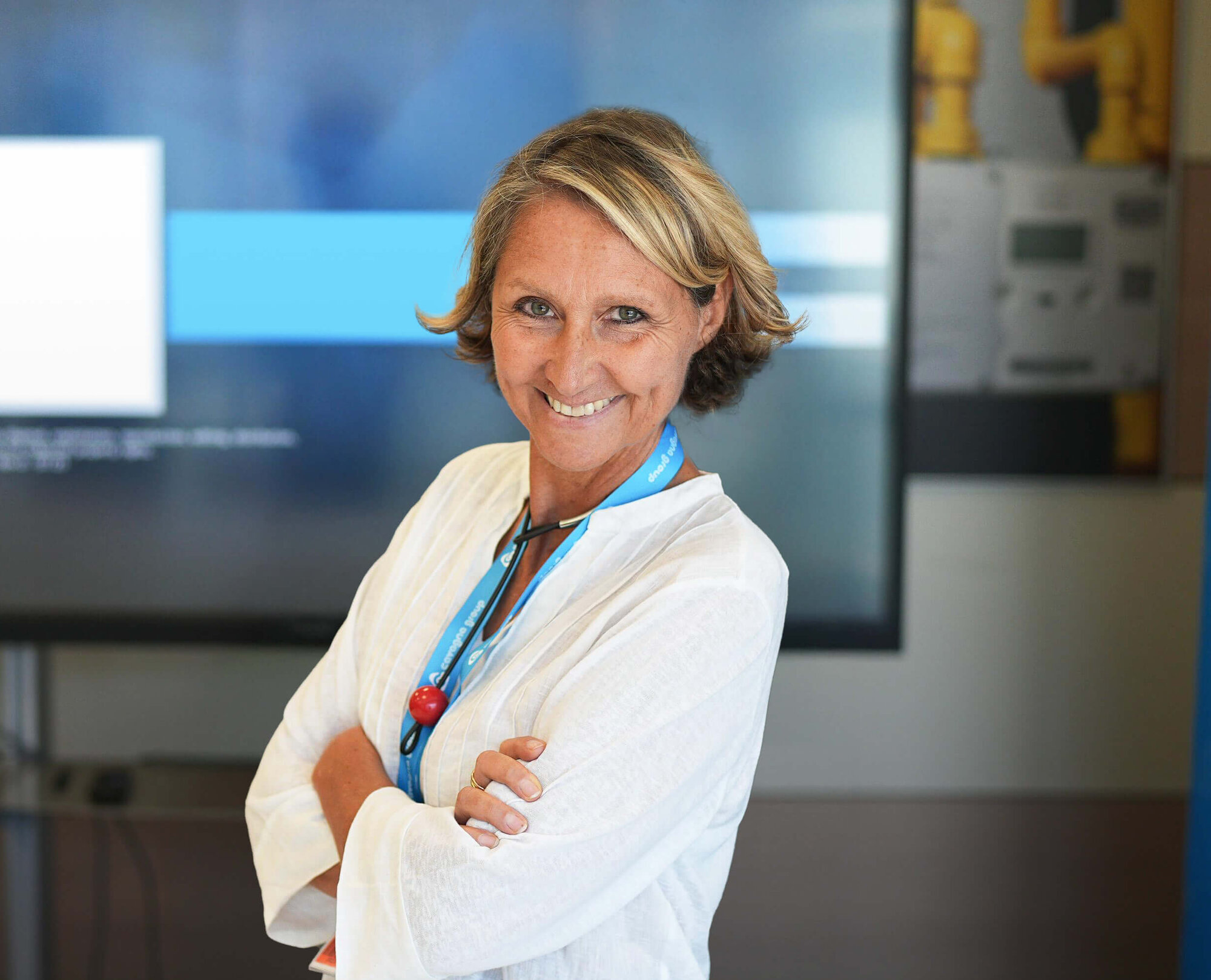
Originally trained as an architect, Raffaella Paniè soon left this field behind to work in branding and communication. After many years at a branding agency, she applied for the role of Head of Look and Image for the Turin 2006 Olympic and Paralympic Winter Games – and landed what would become the biggest position of her career at that point. Two decades later, the Olympic Committee asked her to return, this time as Director of Look of the Games for the Olympic Winter Games Milano Cortina 2026.
Raffaela Panié, after your role in Turin in 2006, you were one of the first persons that were hired for the brand design team of 2026. Designing the branding for the Olympic Games is a massive project and responsibility, which requires a reliable team. How did you build your team?
Raffaela Panié: The experience I gained in Turin in 2006 was really helpful for Milan-Cortina. First of all, it gave me confidence. You realize it can be done, even though projects like this come with a lot of frustration because they’re unlike anything else. Having been through it once, I could draw on that experience and improve on things we didn’t get quite right in Turin. Our team is quite large: about 33 people working on the brand identity and Look of the Games. Around ten of them are graphic designers, led by a creative director, which essentially makes us an in-house design agency. That’s crucial for the Olympics, where everything moves incredibly fast. We handle about 95 percent of our design needs internally and also support the rest of the organizing committee, often on very short notice. Alongside that, we have a team of around twelve architects with experience in event and temporary structures. They work on applying the visual identity across the venues and coordinate closely with the infrastructure architects. There’s also a small project management team handling contracts and administration, and a branding team responsible for strategy, brand personality, sub-brands, and key elements like the mascot, torch, and medals, as well as approvals with the IOC. So, basically for all the branding elements that are not done internally.
At this kind of scale, do you ever still get to be a designer or are you all about orchestration?
No, but I actually really enjoy not being a designer and instead supporting the design team in getting to the right results. I enjoy reviewing what they propose and helping evaluate whether the direction feels right. And sometimes taking on the difficult role of saying, “This isn’t working, let’s stop and start again.” In a few cases it’s been necessary to reset and find something new, fresh, or different. Also, a big part of my role has been bringing together the right people, not just in terms of skills, but also in how they work together. You can have a superstar, but if they don’t collaborate, it doesn’t work. You really need talented, smart people who also enjoy working as a team. We spend time together, we celebrate, and that really strengthens the group beyond the office.
How much time have you and your team had to develop the brand identity?
About six months. From the start, we didn’t want our in-house agency to simply tell us what the brand personality should be. Instead, we spoke with employees across the organization, ran workshops with different groups, and talked to key stakeholders: city mayors, the Ministry of Sport, and both international and domestic sponsors. We also conducted a small but meaningful market research project across Italy, from north to south. The central question we asked was: How would you like these Games to be remembered in 20 years? From that process emerged our positioning, celebrating beauty, but in an unconventional way: the beauty of the Italian spirit. We describe it as dynamic, vibrant, and contemporary. That brand personality has guided every decision since. Whenever we design something, we ask whether it reflects those qualities: Is it something that represents the beauty of the Italian spirit? Is it vibrant? Contemporary? Dynamic? Young?
There’s such a strong design legacy around the Olympic Games. Did you ever feel intimidated by that history? Did it affect your work
Well, not really – though we’re very aware of the responsibility. Working for an organizing committee is a unique experience: You build a brand almost from scratch. Of course, there’s a foundation in the Olympic and Paralympic values, but you still have to define something specific to your country and your edition of the Games. It all happens within a very compressed timeframe—it’s really a race in four to five years. You build and refine the brand until it reaches its peak, and then everything is released at once. By the end of 2025, we will release all graphic elements, and then, just a couple of months later, it’s over. What remains is the legacy. And that’s what excites us in the brand team: what we do is meant to be remembered. If transport or accreditation works perfectly, no one notices – but if something goes wrong, everyone remembers. Our role is the opposite. If people remember the Milan-Cortina torch twenty years from now, we’ve done our job. Everything we create lives on, in images, videos, and archives, in the Olympic Museum in Lausanne. So for me, it’s exciting more than anything.
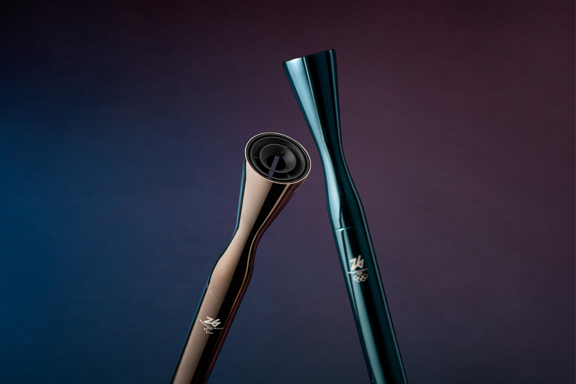
Could you walk us through the process of designing the torches? You worked with an external designer, Carlo Ratti. How did that collaboration come about?
The process for the torches is similar to the medals: they’re usually provided to the committee by a sponsor. In our case, that was an energy company. We were lucky to find highly competent people there who understood the value and complexity of the project. They had previously worked with Carlo Ratti, who we ultimately chose for the design. We worked closely with both the sponsor and Carlo Ratti’s team. One of the first steps was a two-day workshop at the Olympic Museum in Lausanne. The team got to see and handle past torches in the archives. Because this is such a physical object, photos aren’t enough. For example, one thing that came out from the workshop was that the burner needs to be engineered before you even start thinking on the outside. Otherwise, working the other way around will be complex. The interior is just as important as the exterior design, probably even more: Imagine you’ve done a beautiful torch, and then the burner inside will not fit, because it’s maybe too thin, too long, too whatever … So, Carlo Ratti’s team developed a concept focused on the flame itself. In Italian, we renamed the relay “Viaggo della Fiamma” (“journey of the flame”) – it’s not the torch that travels, but the flame, passed from torch to torch. The torch design emphasizes minimal material and clean Italian design, ensuring the flame remains the true protagonist.
For the Paralympics, how important was inclusivity? How does designing for athletes with disabilities differ from designing for the Olympics?
Inclusivity is always part of our briefs. Some elements require special attention depending on the context. For example, the torch has a weight limit so it can be carried by athletes with disabilities, and there are accessories to allow it to be mounted on a wheelchair. In the design of the Paralympic medals, we include Braille and other cues so athletes with visual impairments can distinguish gold from bronze. In general, all digital assets – typefaces, graphics, and layouts – are tested for readability and accessibility. Many elements we design serve both Olympic and Paralympic Games; there’s no complete separation. Personally, I hope one day the Olympics and Paralympics will be fully integrated under a single event. There’s a lot of politics to resolve first, but it would make sense and reflect a truly inclusive approach.
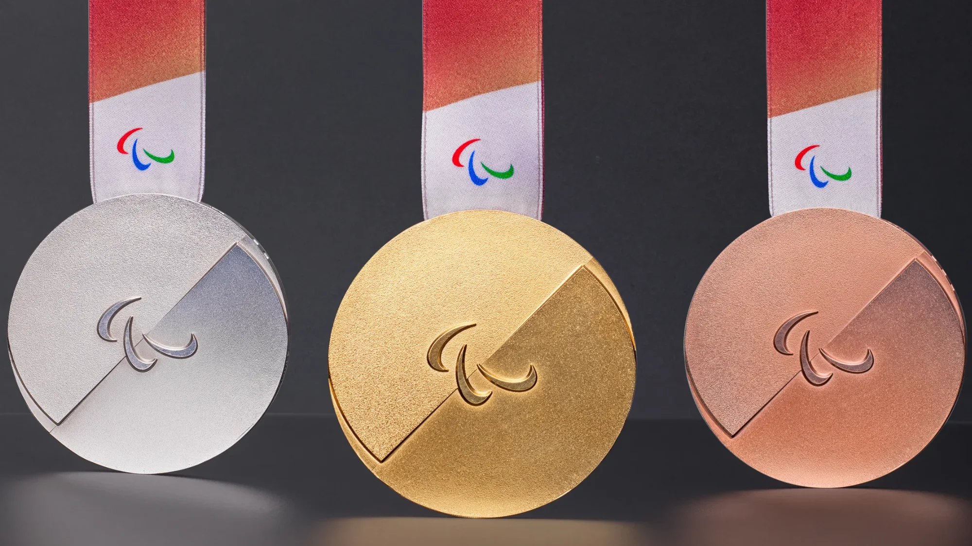
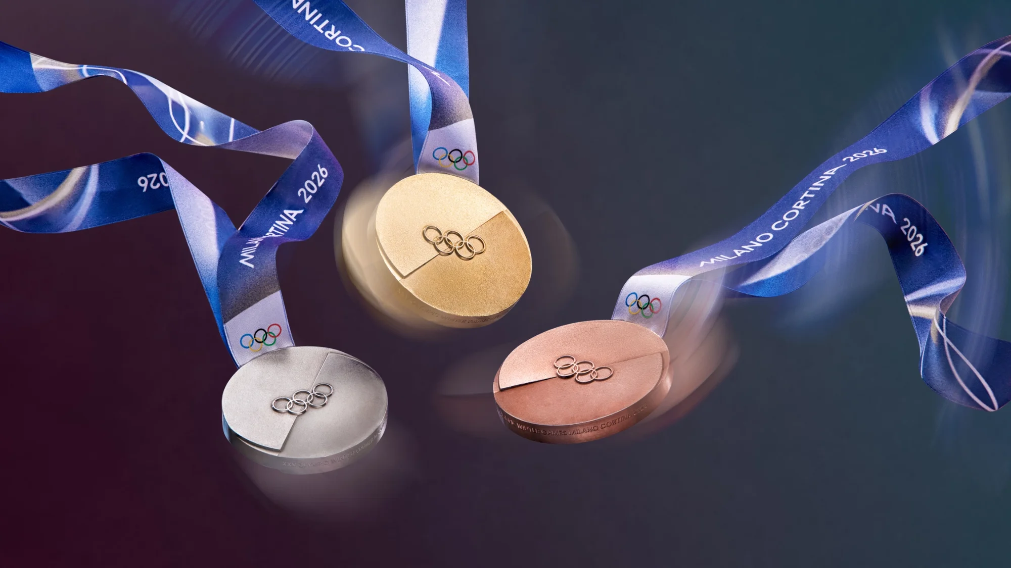
At the 2024 Paris Olympics, there were a lot of issues with the medals, like flaking surfaces that made the medals age poorly. Basically a designer’s or engineer’s nightmare.
Medals are complicated. We have a huge advantage compared to Paris, because it’s winter. Many of the issues in Paris involved bronze reacting with sweat and water, therefore swimmers especially ran into problems. For us, we’re doing extensive testing with the mint house that’s producing the medals. Learning from past experiences is crucial.
Is there something you’re particularly proud of – like a detail or a particular design decision?
What I’m most proud of are the people. The team really makes the difference. Beyond that, the mascots stand out. They were an incredibly complex project, starting from children’s drawings and turning them into fully realized characters. I’m especially proud of The Flo, the secondary characters that almost disappeared along the way until one creative director had the idea to reintroduce them in a new role. I’m also proud of the medals, which we designed in-house. They went through countless iterations, and the breakthrough came when we decided to simplify rather than add. The final concept, two hearts symbolizing that no one ever wins alone, feels clear, strong, and meaningful.
What was the most challenging part of the process for you personally?
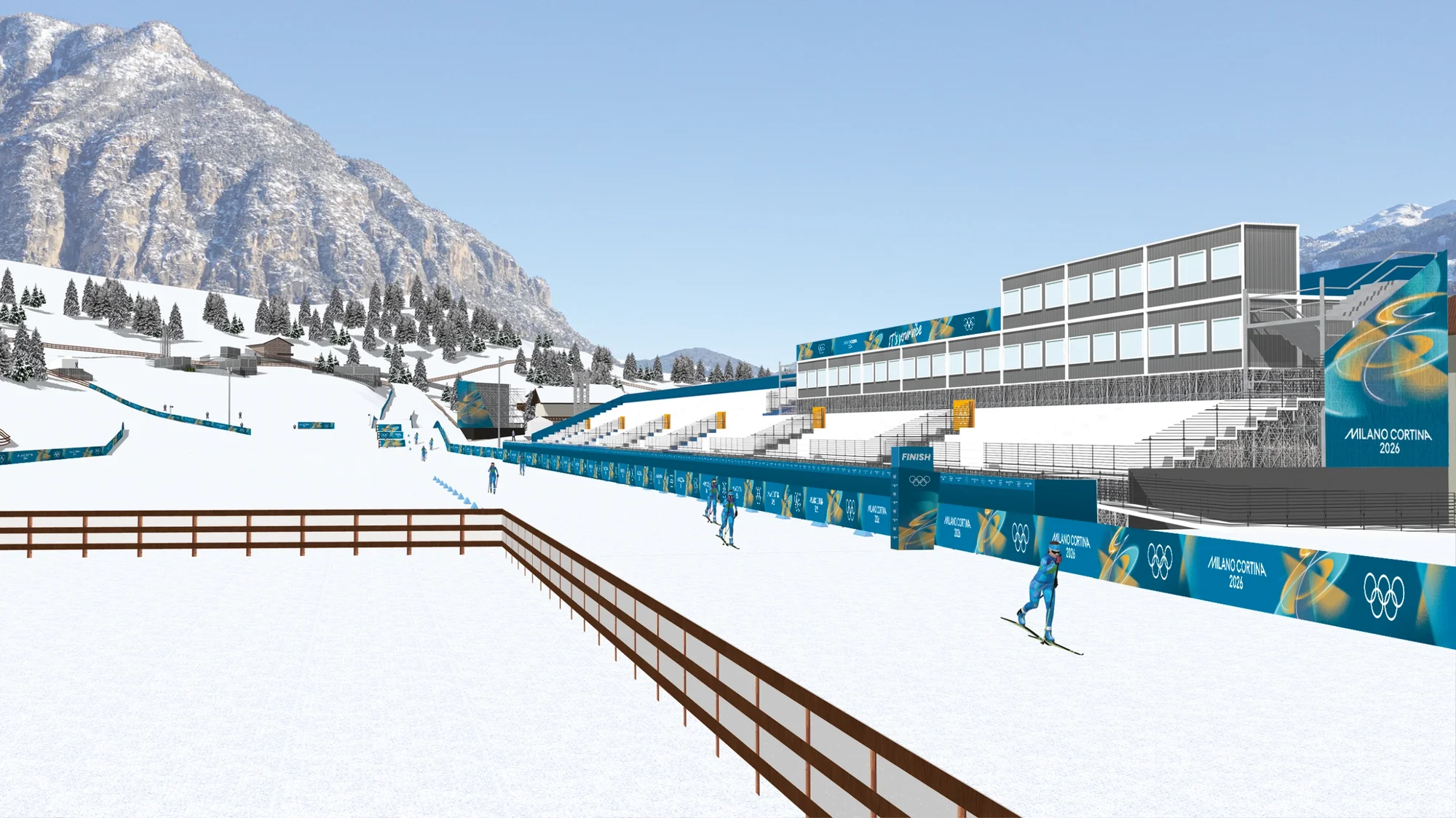
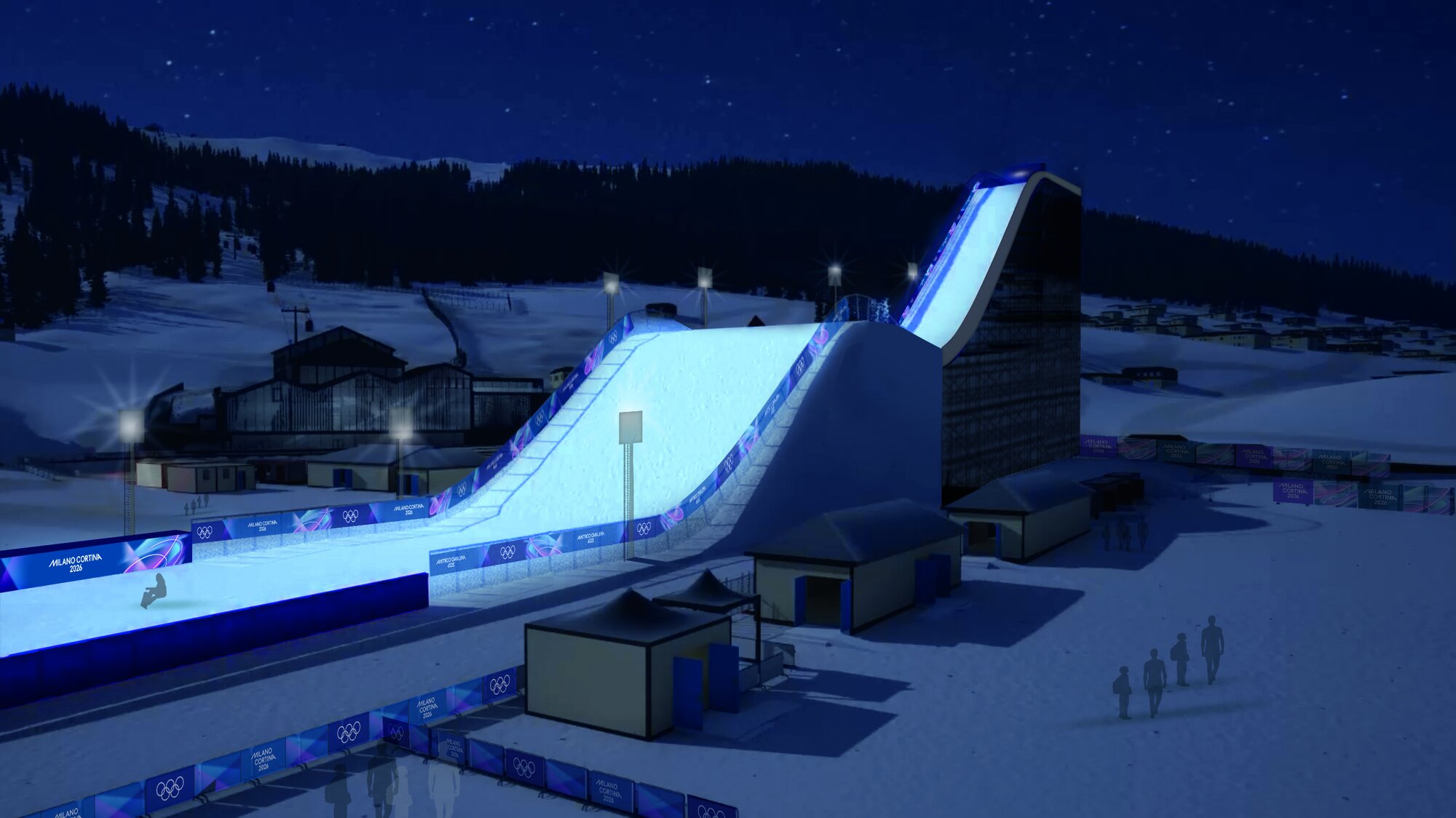
The most challenging part was developing the overall Look of the Games because it is an extremely complex system that has to work across digital platforms, small printed items, and massive-scale applications. We introduced a frosty, snowy shading effect, which looked simple at first, on a PowerPoint slide. But once we moved into production, the files became incredibly heavy and technically demanding, even for high-performance machines. On top of that, the effect behaved very differently depending on scale: what looked great on a small surface could appear clumsy or pixelated when blown up to the size of a grandstand. We spent over a year testing materials, dimensions, and technical solutions to make sure the system worked consistently. It was a long process, but now we’re in a good place and ready to move into full production.
When you’re designing at this scale, you’re essentially designing for television, since most people won’t experience the Games live. What becomes especially important when working on arenas and venues with a global TV audience in mind?
Working closely with the TV production teams is absolutely crucial. We meet with them every week to understand camera positions and sightlines, and to decide where and how the Look of the Games should appear. Even before that, we spent a lot of time discussing colour choices, what works on screen and what doesn’t. We did extensive testing, including a major camera test during the Short Track test events in Milan last year. Some colour combinations that looked great within our design system turned out to be distracting on TV, pulling attention away from the athletes, which is exactly what you don’t want. So we adjusted the system accordingly. Ultimately, it’s about creating a strong, inspiring visual background – colours, messaging, the Olympic rings – while making sure nothing overwhelms or distracts the viewer. The athlete always has to remain the clear focus.
Was there an “oh no” moment for you? Every design process seems to have at least one of those.
We had all of them! We were often in situations where the first idea simply wasn’t the right one. Quite often we’d be stuck between option A and option B. At some point I started saying, maybe the answer isn’t A or B, maybe it’s C. If you’re still debating A versus B for too long, something is usually wrong.
And what are you most looking forward to?
Raffaella Paniè: To be honest, there’s a bit of sadness mixed in. I try not to show that to the team, because they’re still full of energy and excitement. But from a branding perspective, we’ve [the interview was conducted in October 2025] delivered almost everything. By the time the Games begin, most of the work is done. There are no more “babies” to take care of. What I’m really looking forward to is walking into a venue and seeing the Look of the Games fully realized, both in the space itself and on television. But especially to see it in person. To step inside and think, wow, we actually did it.
This interview was conducted in October 2025 and was first published in the thing Magazine.