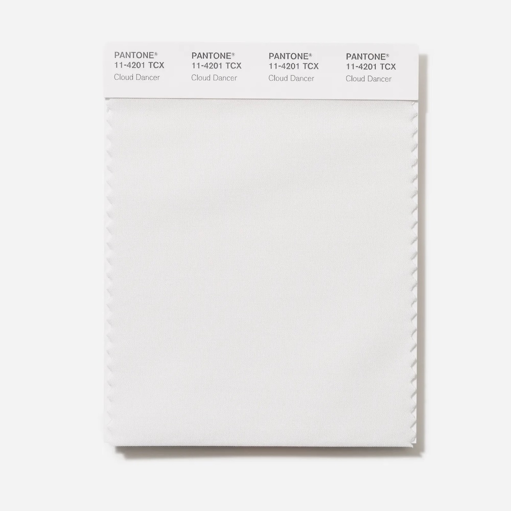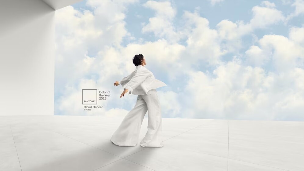
Cloud Dancer: Pantone Puts White in the Spotlight
By selecting PANTONE 11-4201 ‘Cloud Dancer’ as the Colour of the Year 2026, the Pantone Colour Institute has chosen a shade of white for the first time. In a world of global upheaval and increasingly overstimulating visuals, Pantone sees this choice as a deliberate statement – a plea for clarity, simplicity and spiritual renewal. This marks a remarkable shift for Pantone: away from the emotionally charged tones of previous years, towards a colour that does not convey a clear message. Here, white does not function as a neutral surface, but as an active void that draws attention to materiality, transitions and structure.
In this way, 'Cloud Dancer' calls for a return to precise design and a critique of excessive visual stimuli. In architecture, product design and digital interfaces, the shade allows us to refocus on composition and lighting. It forces us to make a conscious decision: which elements deserve visibility, and which do not? In this sense, the shade of white becomes a reductionist tool for designers. Design should work less through affirmation and more through the quality of its omissions.