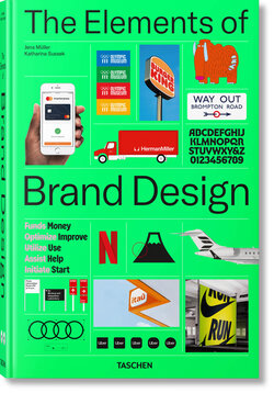
‘Brand Design Today Is Much More Than Just a Logo, Typography and Color’
Your book is impressive in every sense – its size, weight and sheer scope. What criteria did you use when selecting the projects?
Katharina Sussek: That certainly wasn’t an easy task. It was important to us to take a genuinely global perspective and include examples from every continent, a wide range of countries and different cultural contexts. I think we’ve achieved that quite well. Alongside many major brands and the agencies behind them, we also wanted to showcase the work of smaller studios and brands.
Diversity was another key consideration – something that is still too often overlooked today. We were keen to look behind the scenes and gain insights into different design processes. That’s why we travelled to places such as New York, where we met and interviewed Paula Scher and Michael Bierut from Pentagram. We also spent a great deal of time researching online, discovering exciting new projects and following up on brands we had been interested in for some time.
Did you have a specific set of selection criteria?
Jens Müller: The basic idea behind the book came from the observation that brand design has changed dramatically in recent years. Today, many more aspects and elements contribute to shaping a brand and making it tangible. Most traditional corporate design manuals from the 1960s to the 1980s focused on layout rules and grid systems. But branding today is about far more than logos, typography and colour. Brands are now conceived and expressed through a much broader range of elements. That ultimately led us to structure the book around these individual elements, dedicating a chapter to each and illustrating them through outstanding examples.
So that also includes aspects such as tone of voice, distinctive patterns, illustration styles, animation and sound?
Jens Müller: Exactly. That was one of the biggest challenges in developing the book. We needed strong examples for every category, while also keeping in mind the points Katharina mentioned earlier. We didn’t want the book to be overly US-centric, nor did we want to feature five different airlines. In many ways, the process felt like putting together a puzzle.
What international branding trends stood out to you during your research?
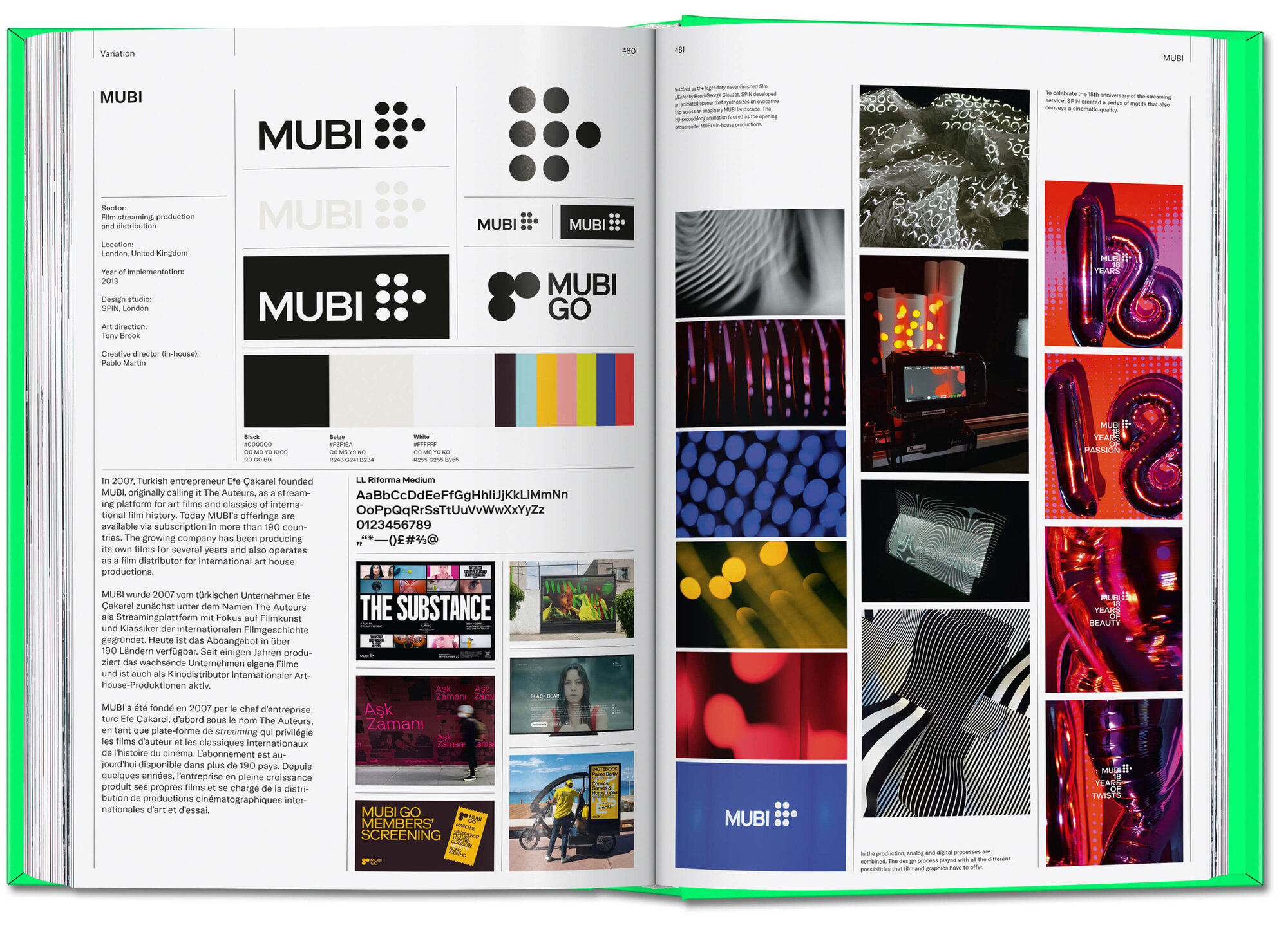
Jens Müller: Beyond the visual trends that inevitably reflect the spirit of the times, the most significant long-term development is how much more diverse the discipline has become. This change has gone hand in hand with the decline of rigid design rules – such as always placing the logo in the bottom-right corner. That simply doesn’t work on a website anymore, let alone on platforms like YouTube or TikTok. The examples in the book show that systematic design is still essential, but it now needs to be far more flexible and allow for a more fluid application.
I was particularly surprised that Volkswagen returned to a two-dimensional logo in 2022. Since the late 1990s, three-dimensional logos with gradients and shadows had dominated. MetaDesign had consistently developed that visual language for Volkswagen – only for it to be abandoned entirely.
Katharina Sussek: That simplification is certainly linked to technical requirements. A logo needs to be equally effective across all channels, media and applications. A simpler design makes it much easier to maintain that consistency and preserve its visual impact. At the same time, in UX design we’re seeing a renewed interest in hyper-realistic interfaces, with extensive use of layering and reflections.
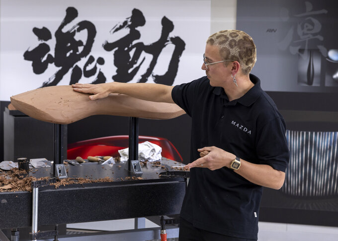
Jens Müller: This flat design aesthetic seems particularly characteristic of the automotive industry, where it represents the greatest possible contrast to what came before. In recent years, many established car brands have clearly sought to move visually closer to younger competitors in the electric mobility sector.
When you conduct research for a book on such an international scale, do national characteristics in branding become apparent? Are Dutch brands noticeably different from Brazilian ones?
Katharina Sussek: It very much depends on the audience a brand is addressing. If it’s aimed at an international audience, those distinctions are much less obvious. As a result, many global brands no longer display strong local characteristics, simply because these are no longer particularly relevant to them. However, with theatres or cultural institutions that primarily communicate with local audiences, regional differences are still very much visible.

Brand identities for theatres, festivals and museums are often particularly experimental. Can – or should – large commercial companies learn from smaller cultural brands?
Katharina Sussek: In Germany, absolutely. We have an exceptionally high standard when it comes to cultural branding, and it compares very favourably on an international level. By contrast, many large German companies still take a very conventional approach to corporate design, applying it with considerable rigidity. Looking internationally, however, you find many examples of a much more open-minded approach that also leaves room for playfulness.
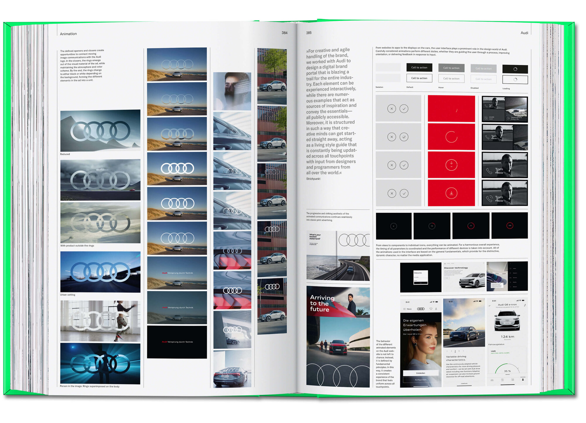
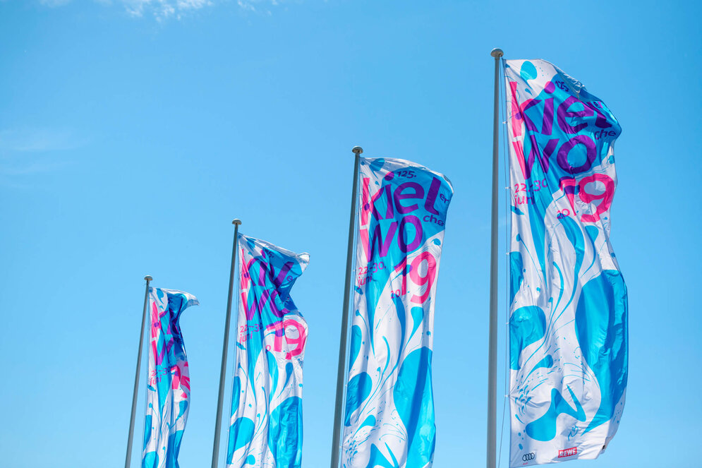
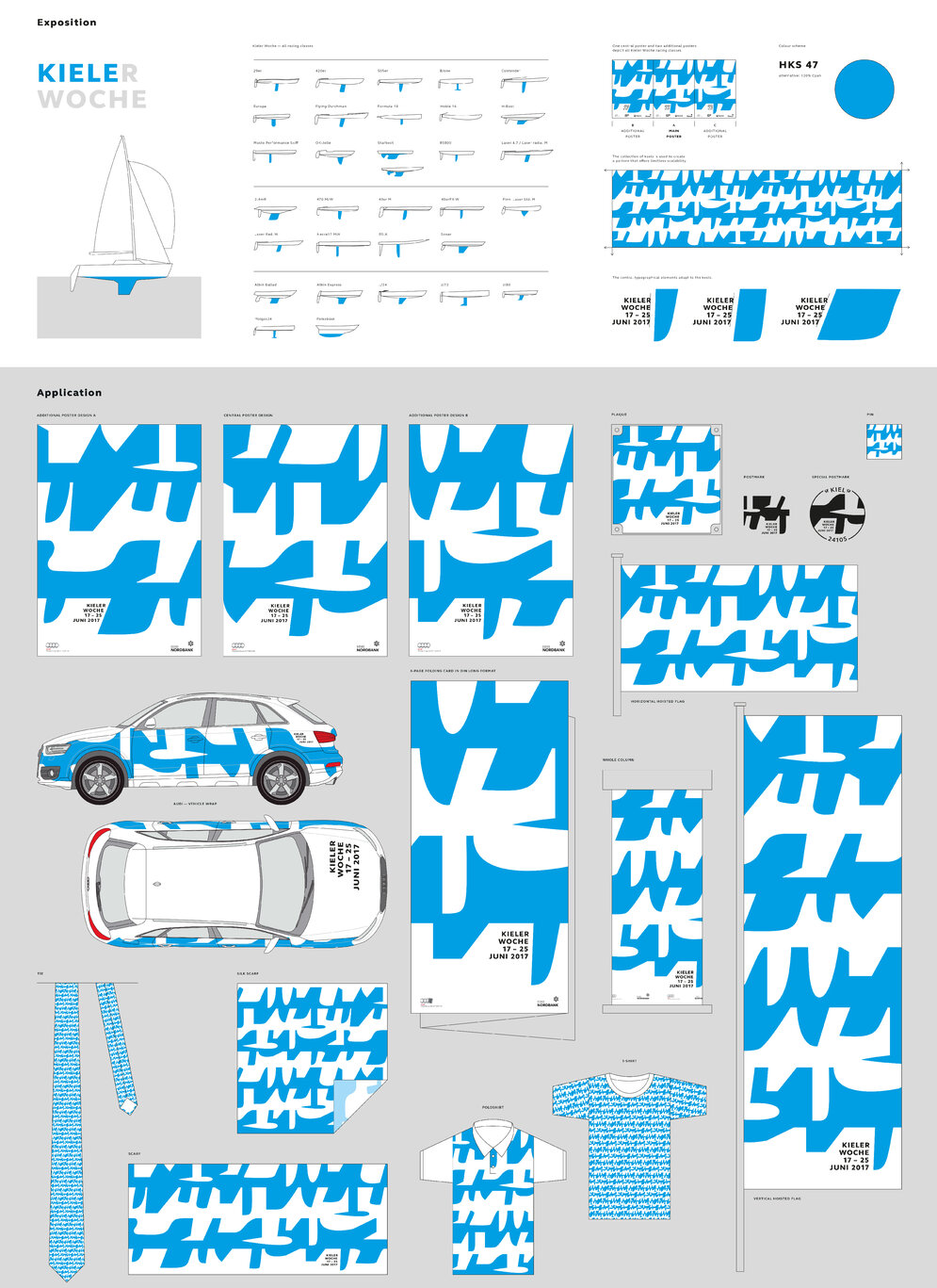
The book also features a number of German heritage brands, including the recent brand identities for Audi, Braun, Kieler Woche and Walbusch – all designed by your agency. What distinguishes German brands in an international context?
Jens Müller: The first words that come to mind are seriousness and reliability, combined with a certain perfectionism. Kieler Woche, on the other hand, is a counterexample. For decades, it has embraced experimentation as one of its defining values. As practising designers – and as observers of the industry – we sometimes wish German clients showed a little more courage and placed greater trust in design expertise. In Germany, design is still too often regarded by companies as a necessary expense rather than an opportunity for self-expression and a driver of growth. In many neighbouring countries, branding is seen as an important investment in the business. Every now and then, we receive enquiries from founders, and it can be quite astonishing how naïvely they approach the subject. They allocate four-figure sums for branding in their business plans, seriously underestimating the value that design can bring to a company.
How can a company tell when it’s time for a rebrand?
Katharina Sussek: Unfortunately, there’s no real rule of thumb. But if it’s been a long time since anyone has responded positively to your visual identity, that’s certainly a sign that it might be worth taking a closer look and consulting experts. (laughs)
Rebrands can also be risky. I’m thinking of GAP’s logo, which was withdrawn after just a few days because customers rejected it. Or the new corporate design for the German state of Hesse, which has recently been criticised. What’s your view?
Jens Müller: I fundamentally believe it’s the right approach for countries, cities and public institutions to invest seriously in branding and clearly communicate what they stand for. In this particular case, though, you can certainly ask why an advertising agency was awarded the project. It’s a bit like going to a pastry chef when what you really want is a nutritious, well-crafted loaf of bread. Here in Düsseldorf, there was once a case where an advertising agency designed a very expensive new logo for the city featuring a smiling letter ‘D’. It soon emerged, however, that a smiling ‘D’ was already being used by two other cities – and by quite a number of dentists.
Your book also includes a chapter on generative design and AI. How do you think artificial intelligence will change branding?
Katharina Sussek: Broadly speaking, liquid design has already become a reality when it comes to applying a brand across different contexts. At the same time, the logo as the core element of a brand has actually become more important rather than less, contrary to many earlier predictions. We’re already seeing AI-generated design elements being used as part of brand identities, and brand-compliant solutions being created with the help of generative tools. I think we’ll see more of that in the future. But the idea that AI will independently conceive and develop complete brand identities – or even produce logos that are both technically accomplished and genuinely distinctive from a communication perspective – simply isn’t something we’re seeing at the moment. When a talented designer reflects on a problem and arrives at a solution that is uniquely their own, there is a quality to that process and its outcome which, at least for now, AI cannot replicate.