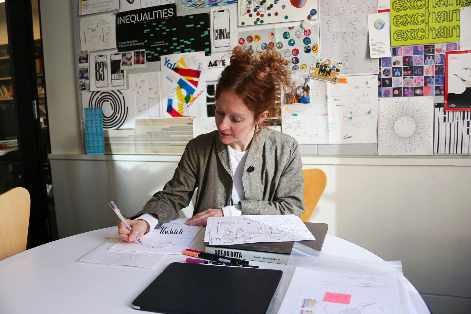
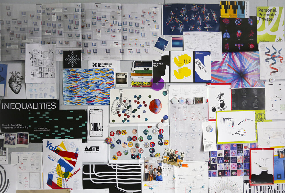
Data Humanism
"My obsession with data began in childhood, counting and sorting the contents of my grandmother’s tailor shop in Italy. I simply loved to organize everything in that shop - even if the nebulous taxonomies I used to organize buttons and ribbons were only in my head," Giorgia Lupi recounts. This was undoubtedly an early indication of her structural view of the world. During her studies in architecture at the Politecnico di Milano, this passion manifested itself in her interest in city mapping. In 2011, she co-founded Studio Accurat (Milan/New York), a company distinguished by its data-based design solutions for renowned clients. Since 2019, the award-winning information designer has been a partner at Pentagram New York.
The Measurement of the Human
At the heart of Giorgia Lupi's work is an enlightening yet radical idea: that data is never neutral. It is an abstraction of reality created through selection, perspective, and human decisions. While technocratic dashboard standards simplify and suggest pseudo-factual authority, Lupi aims to enrich the representation of data by incorporating context, emotions and contradictions. Quantitative and qualitative information are presented on equal terms. Thus, the process of analogue visualisation becomes a way of cognitively grasping reality.


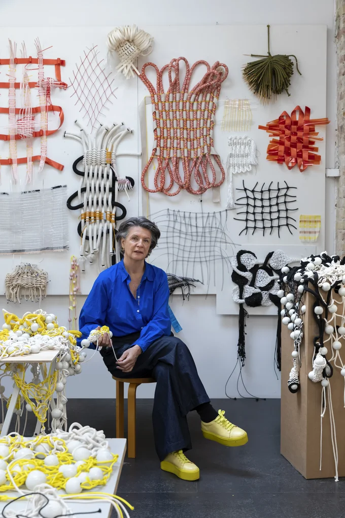
The ‘Dear Data’ project, which Lupi realised with Stefanie Posavec a year earlier, was instrumental to her ‘Data Humanism Manifesto’, first published in 2017. For 52 weeks, the two designers collected personal data, such as encounters, feelings and habits, and created infographics based on this data, which they then sent to each other in the form of hand-drawn postcards. These postcards later entered the collection of the Museum of Modern Art.
While Lupi's approach is rooted in a design tradition extending back to the cartographic experiments of Kevin Lynch, she expands the cultural practice to include a personal and highly aesthetic dimension. An example of this is her early project, 'Bruises – The Data We Don't See', which she created with musician Kaki King. In this project, she translates medical data about King's daughter's autoimmune disease into blossom-like visualisations, thereby blurring the boundaries between information and emotion.
Autobiographical Cartography
Similarly, Giorgia Lupi documented her own experiences after receiving a Long COVID diagnosis in 2020. Over the following four years, she meticulously recorded her symptoms in the form of multicoloured brushstrokes and line patterns, incorporating symbolic elements to mark doctor's appointments, therapies, and tests. She shared this data with her doctors and her team. The result is a painful yet lyrical record which, in 2023, was published as a visual essay in the New York Times under the title ‘1374 Days: My Journey with Long Covid’. It received the Compasso d'Oro last year.
Could data humanism enable new forms of knowledge production? Yes, according to Lupi. In turn, companies that collect information from us should share it with us.
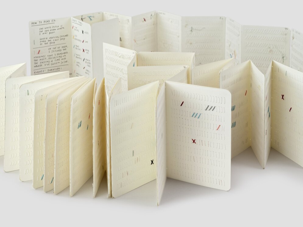
The 'Book of Life' likewise unfolds as an introspective work of art. For this collaborative project with the Moleskine Foundation, she disassembled three notebooks, stitched them together into a leporello, and embroidered a white running stitch for each day up to her 40th birthday. Some of the 14,496 marks have been embroidered in colour and represent significant events.

From Dataset to Design Object
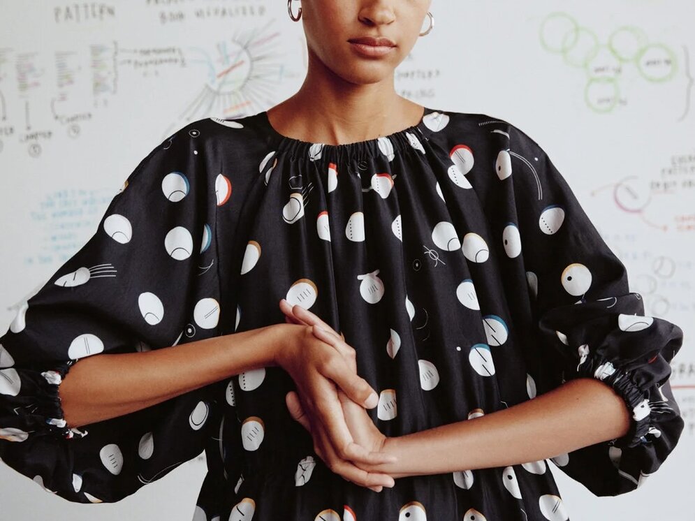
How do the lives of three pioneering women in science – Ada Lovelace, Rachel Carson and Mae Jemison – come to life in the clothing of the fashion label & Other Stories? Through their biographical data, which Giorgia Lupi has transformed into patterns and designs.
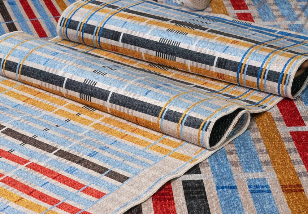
Lupi's team demonstrates the potential of sublimated data graphics equally well in their collaboration with the Majorcan tile manufacturer Huguet: By transposing Chopin's 24 Préludes into a tile collection. For carpet manufacturer Well Woven, the team undertook extensive research into ancient, lost or endangered textile techniques. This resulted in a series of carpets under the title ‘Unraveling Stories’ that reflect 59 traditions from diverse regions around the world. The graphic structures generated from the datasets encode information about the materials used, the processes involved, and the origin of the carpets. In terms of form, the project draws on Anni Albers' grid-focused woven works from the 1930s.

‘My personal belief is that data is language. It’s a lexicon for accessing the full complexity of human ideas, stories, and behaviors. It’s a vocabulary that anyone can use and anyone can understand. If we learn to truly ‘speak data,’ we can open up new worlds of meaning about ourselves, others, and everything around us.’
Giorgia Lupi
Space for Interaction
An important aspect of Lupi's work involves collective and participatory methods of collecting and visualising data, both analogue and digital. In 'Telling My Story Through Data', young people documented their experiences at the Cooper Hewitt Smithsonian Design Museum by attaching coloured ribbons to a tableau.
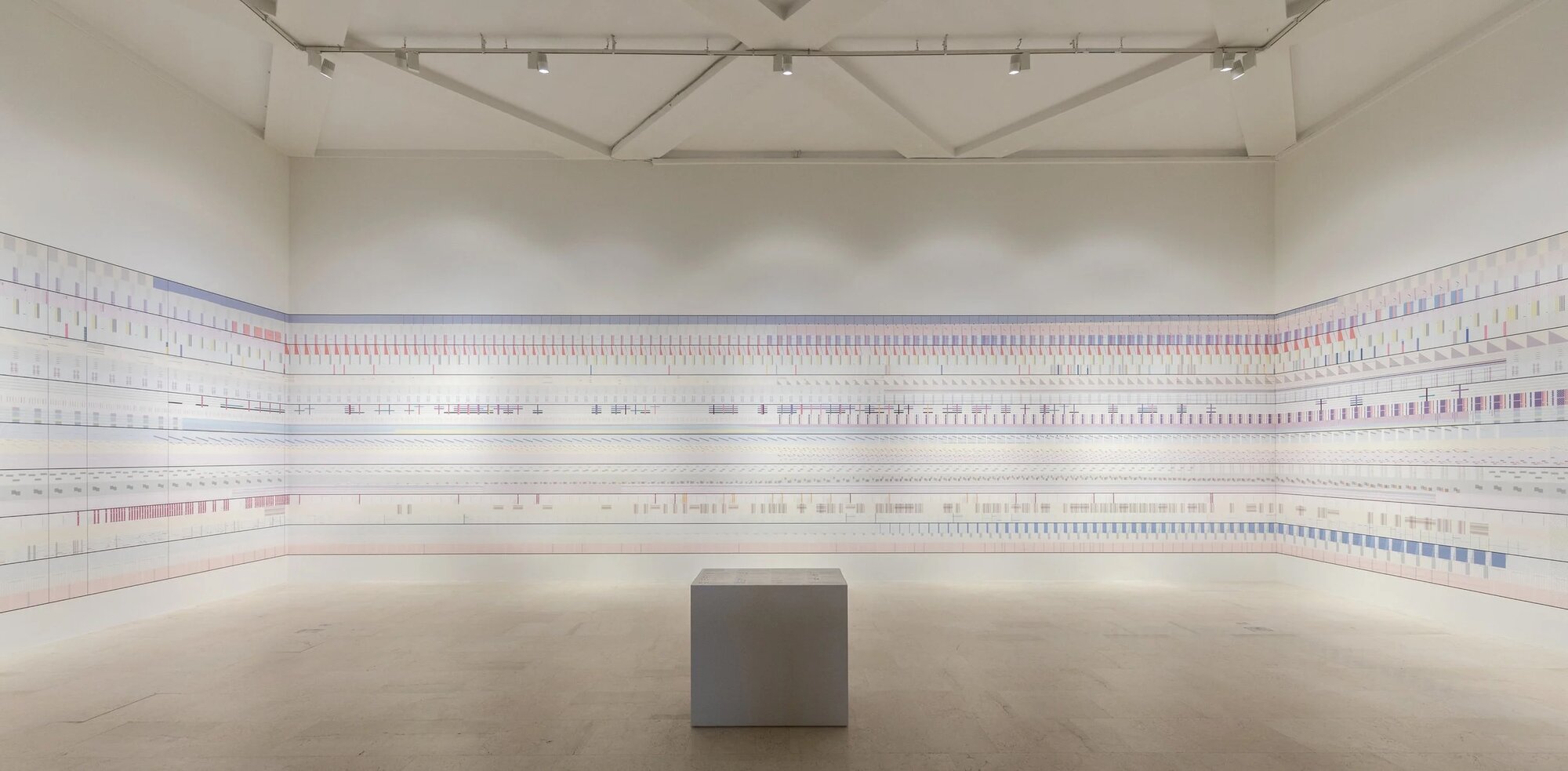
During the 22nd Milan Triennial, a 30-metre-long handcrafted wall tapestry ran through ‘The Room of Change’. This tapestry shows how environmental factors have changed over the centuries and invites viewers to use an information display to zoom in and engage consciously, in the spirit of 'Slow Data'.
In 2025, Lupi and Pentagram created the visual identity for the 24th Milan exhibition, which focused on social inequality. This flexible, statistics-based design system guides visitors to the Triennial through global challenges such as education, migration and climate change. As part of ‘Climate Tech Map’, the creative team also engaged with the latter. This interactive platform brings together over two thousand climate protection technologies. It is intended to serve as a tool for navigating a rapidly growing field of innovation, making progress, potential, and gaps in the global energy transition visible.
Data with a Future
The relevance of Giorgia Lupi's work becomes visible not through the creation of a new aesthetic, but rather by how she delineates a new responsibility within the context of a society in which data largely determines our actions and our communication. Whoever shapes it also shapes reality. A reality that can be made tangible through precise analysis and intuitive design.
Perhaps the most significant shift that Data Humanism brings about is the one that becomes clear in the exhibition 'Giorgia Lupi. L'umanesimo dei dati' in the magnificent Baroque halls of Palazzo Leoni Montanari: data is no longer understood as an endpoint. It is a starting point and thus something that must be interpreted, questioned and thought through further.

Speak Data – Artists, Scientists, Thinkers, and Dreamers on How We Live Our Lives in Numbers
Giorgia Lupi, Phillip Cox
Chronicle Books
ISBN: 9781797230276
Drawing on Giorgia Lupi's work, 17 personalities, including John Maeda, Seth Godin and Paola Antonelli, discuss the significance of data.